 Well fokes this is my final blog, thanks gosh, so Im going to try to make this a lengthy one. Digimon digital monsters was one of my favorite cartoons growing up. This here is a scene from the third season of digimon, where the first two seasons of this show had a digital world and creatures, this season made them out to be just a television show. So the pre-existing series characters didn't exist within this season or world. In this season the Digimon was a creation from a experiment on the computer which later was brought to live. Digimon in this season once dead, could not return in the shape of a egg like the other two seasons, once the digimon was destroyed their data was absorbed into the victor of the battle. The human partners was called Tamers, and these Tamers could used cards to enhance their digital partners skills and powers when used. The little guy in this image with the bigger ears and symbol on his forehead had the power to help the digimon digivolve into bigger and badder creatures to fight their battles. Although this series started out very interesting and nice, the ending lost me and I didn't really care for this season anymore. I felt like the creators were creating a story that was far too stretched from the original story plot and I became lost. But the first season of this show will forever hold my heart.
Tuesday, December 8, 2009
(N 201) DiGiMON DiGiTAL MoNSTERS
Well fokes this is my final blog, thanks gosh, so Im going to try to make this a lengthy one. Digimon digital monsters was one of my favorite cartoons growing up. This here is a scene from the third season of digimon, where the first two seasons of this show had a digital world and creatures, this season made them out to be just a television show. So the pre-existing series characters didn't exist within this season or world. In this season the Digimon was a creation from a experiment on the computer which later was brought to live. Digimon in this season once dead, could not return in the shape of a egg like the other two seasons, once the digimon was destroyed their data was absorbed into the victor of the battle. The human partners was called Tamers, and these Tamers could used cards to enhance their digital partners skills and powers when used. The little guy in this image with the bigger ears and symbol on his forehead had the power to help the digimon digivolve into bigger and badder creatures to fight their battles. Although this series started out very interesting and nice, the ending lost me and I didn't really care for this season anymore. I felt like the creators were creating a story that was far too stretched from the original story plot and I became lost. But the first season of this show will forever hold my heart.
(N 201) YiN-YaNG

Yin yang, the universal symbol for contracting forces but also the universal symbol for balance as well. Yin represent the black side of the symbol, which is cold, passive, dark and while the Yang represent warmth, active, and brightness. I have done my research on Yin Yang sign only to find out that the sign has the five natural elements within its design. Fire and Metal I believe is in Yang, while Water and Wood is in Yin. But I havent forgot about Earth, Earth is within both of them, thats whats the circles in each represent. Earth is the balance that holds the Yin Yang sign together. In this picture I see a tiger and a dragon, I think this has something to do with Chinese tradition dated by long ago with the tiger and dragon beast. The way of the tiger, the way of the dragon lol.
(N 201) Yu-Gi-Oh

Yu-Gi-Oh the show that had its own following for years. I can honestly say I was a follower for like two years. I spent most of my time and money on these cards and battled people. I developed what I called a BUG deck, where most of my creatures in my deck of cards was bug type monsters. In my deck I also had some other creatures like machines and warriors just in case a bug trap or magic card would block my creatures from attacking. But anyways back to the series, Yu-Gi-Oh was a good series but some of the card effects on the show differ from the cards effect in real life. The graphics was very good in the series though and i liked the storyline. My favorite character was of course the bug guy who was in from time to time, and I did watch faithfully.
(N 201) HaLO DeSIGN
 Halo, one of the more desired games ever played on by like everybody from college students to little kids in third grade. The graphics are unbelievable and the gameplay is just as amazing as the graphics. Of course this is a shooting game, which is why a lot of students that are male play, something about guns attracts guys like me to games like this. One thing I never like about games like these was that you can never see yourself play just the gun or weapon your carrying. The landscape in the game is well put together as well, the company of this game have been advancing the game features so much that now it looks real like the real thing.
(N 201) X-FACTORiN
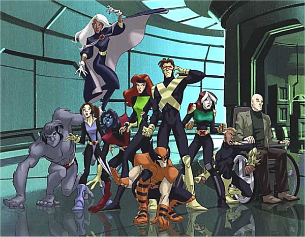 X men evolution. I remember when the first episode came on I was in fifth grade and it was on a Saturday on kidsWB. I was always a fan of the X-men story and original series but after seeing the new animation and graphic effects I soon come to quickly fall in love with this series. X-men evolution was based on how the team met, although alot of its storylines were stretched different from the original stories of the team. The original X-men had Beast, Angel, Jean Grey, Cyclops, and Iceman, the new series had Jean, Cyclops, Shadowcat, Nightcrawler, Spyke, Rogue, and others as the original teens to enroll within the school for gifted youngsters. The X-men outfits centered around the color scheme of black, unlike the original series where it was blue and yellow. Wolverines outfit was orange and black instead of yellow and blue, although it could of been black that the creator was trying to go for and not blue.
(N 201) Da BOONDOCKS

Hmmm the Boondocks. The Boondocks remind me of a black family guy in a way. This show contains alot of foul language and some parts even nude, but the storylines half the time are pretty good. The animation and graphics are far better then family guy. The details in the skin and in the cloths was alot better then I had imagine they would be. In the comic strips of this show there characters arent drawn that well, but the animated series is really amazing.
(N 201) iNVaDER ZiM

Invader Zim, one of nickalodeons most disturbed cartoon series ever shown on national television. As disturbing as Invader Zim was, I loved the show. Invader Zim was about an alien who was so annoying that his people wanted him gone, so they sent him to a far away planet for him to stay on and amuse himself. The instructors gave him a beat up robot named Grr and as the kids watching the show came to noticed is that Grr is very lovable and likable character. The graphics within the show was above average if you asked me, and the storyline and plots were ok. Invader Zim was more so funny and disturbing just knowing that Zim would never destroy or conquer Earth, but just amuse the audience in the meantime. Zim would react to simple thing in life, like bees, pigs, cows, even stomach aches. Grr would react to these things in a more humorous and comical way. But this show was very funny and more of the more enjoyable shows on nickalodeon.
Monday, December 7, 2009
(N 201) ANiMATION Balls

This animated photo is of tennis balls laying in the grass. The one on the left is just an ordinary ball that doesnt do anything and just sits there waiting for someone to put it in motion. The tennis ball on the right is animated. It displays eyes and a mouth I believe. The animated moving tennis ball even is moving by itself. It has a funny look on its face like its sad or worried or something. Im looking in the background and it looks as if the tennis balls are in wide open land in the landscape behind them. The line below them indicates the tennis line though.
(N 201) DragonBallZ
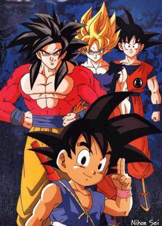
This image shows Goku many styles in his many lives, yes i said many lives. Goku has died more times then I have counted. Dragon Ball was the original series where Goku used a cloud to fly around and didnt have any real abilities other then turning into a huge monkey. Then once he became older his powers started to emerge and he became stronger. As he grew up, the different styles he had. Goku became a Super Sayian and his hair became a golden yellow and shot up. Goku later had many more Super Sayian 2, 3, and 4 later on in the series as well.
(N 201) BeAST WaRS

Beast Wars, one of the more advanced shows of its time. Before Beast Wars I have never seen animation done they way the creators of this show animated them. This here is all the maximals, good robots while the predicons are off somewhere. I actually have all three seasons of this show and its after season called Beast Machines which eliminated about halve of the surviving maximals that remained after the war was over. I grew up watching this show along with Dragon Ball Z. One of my favorite characters was Rattrap, just because he had a smart ass mouth.
(N 201) Subliminal Here!!

I know this is a subliminal message and also a cup but I dont know what this is suppose to say. I think its suppose to spell out a word but I can make it out. As far as the designs go, I like how its black for the other letters but as far as it goes with the word they wanted to spell out I like how they used white. This is actually suppose to be a cooler. OH!! I got it! It say "drink up". lol
(N 201) AVATAR: Day of Black Sun
(N 201) AVATAR
(N 201) Da Power Of Three
 Well this is an image that I have put together and made myself. The first image is suppose to represent the past, but yet still present. While the second image of myself is suppose to represent the current present which is a new self, an altered ego, Danny. Then the third is suppose to be the future which is unknown at this time in my life. The first one, Ereck, is called "the shell" which is like a vessel in which hold everything inside and holds the others inside as well. The second image, Danny, is called "the impulsive freak" a new self that acts out randomly and recklessly. The third is a mystery, so I guess we will see.
(N 201) HiGH-TECH Comp.
 Hmmm when I first take a look at this image I thought it was a phone, but since I searched High Tech computers it had to be one. I wonder how small it is or how much it weighs. I also wonder if the screen is a touch screen or if its not. The design is simple but it works for this 3G. I dont know if I would want a computer like this...looks too much like a phone and I would get confused all the time. Clearly this technology hasn't reached the US yet or else or I would have seen it by now.
Wednesday, November 25, 2009
(N 201) MaNi-PiX
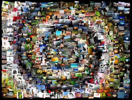
I think its cool how they combined all of these pictures together to form one whole one. I think they was trying to form a rainbow I think, but I'm not sure. I never knew of how someone could forge something like this to create a bigger master piece. This design is different from the others cause the pictures they used arent lined up but scattered which makes a neat effect.
(N 201) Tattooed UP

This here is a picture of Rachel Summers, she is the daughter of Jean Grey and Scott Summers in another reality. She takes on the traits of her mother which was the phoenix at one point in her life. In Rachel's reality, Jean never got rid of the phoenix and Rachel inherited them traits. The tattoo on her back is just a lil dose of the tattoos that are suppose to be covering her entire body. Rachel is known as the Phoenix II, and was imprisoned when she was younger and tortured by a cruel man. Nice designs in this picture though.
(N 201) ANi-ManiA

Some how some one put a combine photo of all the best anime shows out there. Inuyasha, Bleach, Naruto, Ghost of the Shell, and well I don't know the one with the girl in the pink hair. But my first anime love was Inuyasha which I was sad when it went off. Naruto is a good show to watch as well, but like Inuyasha I was sad when they stopped showing it on Cartoon Network. Im still currently watching Bleach, but be missing all the shows when they do air.
(N 201) HaNDS

I honestly dont like this drawn picture. I think the idea behind it is great but the picture could use more work. If the person would of made the hands more realistic and the designs within them flow with the structure of the hand or place the palms upward. The hand designs remind me of the scarfs that black african american women wear, I dont know if thats a good thing or bad thing.
(N 201) MiNi-ME

This here is a little drawing I did on Illustrator. I created a tiny version of myself to match one of my common outfits and looks. As you can see the main shirt matches the hat, but the hoodie underneath is a different tone of red which it is in real life as well.I spent a huge amount of time working on this character, trying to get every possible detail exact so it would look more and more like me. The shirt logo on the front took some time doing and was confusing at times but I got it, its not perfect but close to it. But here is my MiNi-ME...lol
Monday, November 16, 2009
(N 201) ANi-GeLiA

I know for a fact that it is a long and painful process to design and make a character with a program like Illustrator. Capturing all the detail and making sure that the character you are drawing and creating looks the way you want them to look. In this picture Angelina looks very much like herself. They captured her very intense and strong facial features and they also her body structure as well. Angelina's lips are your signature feature, so the person who designed this picture knew to make sure her lips were on point. And dont let me get started on the hair, because her hair looks amazing I just hope one day I can be able to design something like this.
(N 201) DanCiN PPL
 WHATS WRONG WITH THIS: What I think is wrong with this designed picture is that its too simple. This photo is not complex enough and needs more to be added to its design. What I would have changed or made this piece different would have been the placement of the characters. I would have some overlapping one another and on different levels as well. I wouldnt of have the characters in a straight line cause that is simple, too simple. I also would have placed a different color background for this photo. I would have put purple or red as the central color in the back.
WHATS RIGHT WITH THIS: Other then the poses are neat, nothing is right with this if you ask me.
(N 201) WoLVERiNE & Da X-MeN
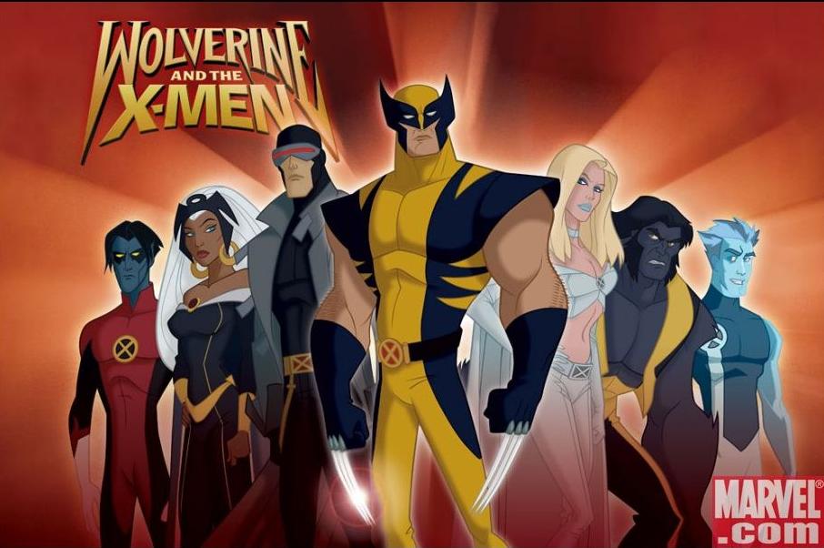 My first thought of this television series was that it was corny, retarded, and I didnt like the animation done in the series. When I say that i didnt like the animation used in this series, I mean I didnt like the overly sized arms, skinny waist, and things of that nature. I had to warm up to this series. I now love it. I like how they redid X-men and switched up the events. The one question I have is that in the original series Wolverine was troubled, wild, uncontrollable and angry all the time. Its funny cause in this series Wolverine is all level headed and acts completely opposite of his original character. When Jean Grey went missing in the old x-men Wolverine would have stopped at nothing to find her, but in this one, I dont even think he cares that she is missing lol.
(N 201) RiHANNA VZ G.P

Automatically when I look at this picture, the song that the guy who fused Umbrella and Tenderness together, pops into my head. I have the song saved on my hard drive as we speak. What doesnt work in this design is that its too simple and plan. I would have chosen a set of colors to put within this design and would have ran with it. Next, I think that having Rihanna's eyes in this design is cool, but I see nothing to indicate Tenderness or G.P. I would have put a picture of them on it as well or fused a picture of Rihanna with them. But I still love this song though.
(N 201) HeAD FiRST
First off Im going to say that I am learning alot from this book. This is the text book used in my CSCI-N241 course, which I was struggling in the beginning of the year but havent had any troubles lately. Whenever I look at this book I dont know why, but i get inspired. Inspired to work on web pages and create websites. Everytime I look at this cover i pick up my book and at least flip through it. I like way they used purple on the cover, its like they made the entire cover based on the purple scheme.
Thursday, November 12, 2009
(N 201) MeTA-BEE


This had to be my favorite cartoon series in seventh grade and some of eighth. Metabee was this main characters name. His story is that he is suppose to possess a rare chip inside of him and that it gave him an advantage over the other battle bots in the series. By the way the series was called MetaBots. As you can see this character is modeled after a beetle, but I dont know which one though. I have always been fond of the color scheme used is this characters design. The characters design is very detailed and well put together, but in the series it wasnt that great in the animation. I still like this show though might go watch it when i get home.
(N 201) Six PERSONALITIES
 Yes its true, I have five twin brothers. Im just kidding. I made this design for my myspace background last year in the summber of 2008. I actually designed it about a month before attending IUPUI. I became a pro at Photoshop at a early age in my life.
(N 201) BaD DeSiGN
 First off I'm going to say this piece I love the picture within this design work, but I have nothing but respect for the designer of this, it kind of sucks. Im going to start with the header. The header text is not even visible enough to read, I see it say "Get Started Now" but still hard to read. "Reguest a free quote" I have no idea or clue what that means or what this image design is meant for. I do like how the background in this image is color cordinated with the stone within the image. The stones are the focus point of the design, but they dont sit exactly in the center of the piece but a little more to the left side, which I like.
Wednesday, November 11, 2009
(N 201) Superman VS The X-men
I was browsing the internet and came across this picture of the X-men having it out with Superman, I thought this was hilarious. Its like Marvel vs DC, but i cant say good vs evil because both parties are good as far as i know. Its fun watching this image cause if you havent noticed the Professor is attacking Superman's mind, Rogue is trying to take on against Superman's strength (seeing how both of them are similar in abilities), and Wolverine is distracting him taking a beaten since he can withstand it. But overall I completely love this image.
(N 201) i DReAM oF JeANiE

For some reason over the past five years I have had an obsession with DUAL PERSONALITIES a.k.a Multiple personalities. The reality of this extraordinary event taken place is very unique. See the truth behind multiple personalities/D.I.D is a mental illness caused at early ages. D.I.D can occur from mental or physical abuse at early ages of life where the mind is still fragile enough to fragment itself creating what is known as ALTERS. Alters are the personalities that are not the SOUL PERSONALITY. There is said that some people can possess over hundred of these alters. In the past they believed these people were possessed by a demonic spirit or the devil. Some even believe that the person had possessed two souls in one body, in JEAN GREY's case that is true. In the X-MEN series, Jean had experienced having a dual personality within her. When trying to save her friends from their ship crashing she had been possessed
by an entity named "The Phoenix". This Phoenix possess unlimited power which became too much for Jean fragile soul and body to handle. This is the perfect picture for Jean in her distress. She displays in this picture distress, concern, pain, and torment. Jean was tormented by the power of the Phoenix.
Monday, November 2, 2009
(N 201) NEo LIghts
Hmmm honestly I dont have a clue what gender this person is. It might be a man? It might be a female? It might even be a cross-gender or trany. The colors used in this picture goes together. I like how it goes from cool to hot, going downwards. The way this piece is put together is simple designs but placed into one item to form a whole new idea. Actually after looking at the lips this person may be black. Just an idea.
(N 201) HALLOW EVE TREAT

Yes ladies and gentlemen, this is Ereck Butler. This outfit was for halloween and halloween only. I had alot of fun this year, I had an enjoyable time. I was so well dressed up, that no one recognized me. What I did was take some lessons on youtube on how to apply make up. I went out with some friends to Long john silvers, and this guy even hit on me. the guy didnt even know I was really a dude. I was suppose to be Rihanna, but by the end of the night I thought I looked more like Ciara then Rihanna. But my main point is that placing on this make up was like designing a artwork or something. Applying the different colors together to create one type of look, and making sure that the colors fit the look as well.
Wednesday, October 28, 2009
(N 201) Digital Candy
 “Digital Candy” when searching online I came across a wide range of sites that have that phrase in it. Digital Candy thermometers are one of the sites I came across when browsing the web. There was one site that had “Digital Candy 2.2” which was a software program that enables easier browsing or something along the lines of that. I came to find a site that was “Digital Candy Layout”, a site for layouts of what I assume candy or wrappers that was for MySpace backgrounds and page set up. I still not sure what “Digital Candy” is though.
 Wednesday, October 21, 2009
(N 201) SUPeR LeAGuE
 The Justice League of America, also was known back in the day as the Super Friends are cleverly painted. But Im confused on the direction from where the light is coming from. The light is hitting Superman dead on, but there is another source of light that is hitting all the other fellow members on the league. Although this is a comic so the league could be in a world that has to solar light sources. If you focus on Superman's shoulder you will see the Antman. In front are the three primary superheroes which are Superman, batman, and Wonderwomen, and the rest are pushed back in the back since there not important.
Monday, October 12, 2009
(N 201) Flying Fish

I am amused by this photo of this flying fish. The background matches up with the fish bowl as the water does too. I dont completely understand how the plus signs go with the picture. Maybe the designer meant for those to represent life or something. A first aid pad could be the plus sign too. I think this picture maybe about suicide, the fish is trying to die.
(N 201) C-H-O-COLATE
 I got this image which is actually a web design page. In this picture web design page I see the designer used brown as his primary color use. I like how the colors line up with one another, but its not that great. The image is completely boring and safe. I think it should use some edge to it.
(N 201) World On Web

I believe the meaning behind this graphical design is World Wide Web, literally. It looks kind of 3D animated. I'm feeling the reflection at the bottom of the screen. But this piece is within the dead center of the image as well which is common i guess. The designer used the Earth as the planet shooting from the laptop screen, which makes sense since we call the internet world wide web.
Sunday, October 11, 2009
(N 201) Our President

Look at our president cheesing hard. I honestly dont know what the heck was used to make this graphical image. Adobe's illustrator maybe I think. But i give it to whoever created this image cause it looks lifelike. President O looks as if he was a lil kid posing in this photo with this big smile on his face. And the message on the picture is really funny.
(N 201) SpiderWoman

Looking at this image reminds me of a black widow for some odd reason. Probably reminds me of a widow because of the woman in the image and the spiders surrounding her. But this woman looks evil like she is possessed by a demonic spirit or something, but the composition of the placement of things is amazing. The spiders positions forms a triangle if you look hard enough. The hand coming through the web is as if that woman is emerging from her coccoon or something.
(N 201) A Mothers Love
 I just saw this one right after I saw the last post I posted. This photo is called "A Mothers Love". Like the little feet to the bigger feet in the last post, this one is clearly a mother and her child (boy/girl). There is a saying that goes "there nothing stronger then a mothers love". I think in this picture or what this picture was trying to show is that saying of a mothers love.
(N 201) OLD N NEW
 Was still searching random pictures on the web and this picture caught my eye. I instantly thought old and new. Like a baby just being born into this world and the older guy who has been in this world for a while. Then again I thought father and son, I know its silly cause i dont even know if the baby is a boy or girl lol. Although is this picture is in the dead center of the photo, so its kinda like boring in that since but still caught my eye.
(N 201) Cat Eyes
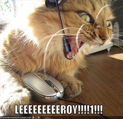
I would say this is about half of the females in the world online, but I dont want to go there. Just on the web searching on google for more random pictures and came across this photo of the cat on the computer. This picture made me laugh when i first saw it. I like how the eyes are about to shoot out the head of the cat.
(N 201) Solar

I dont know what it is, but i have always had a fasination with the sun. Googleing random pictures I ran into this photo of the sun. The sun is shooting off some extremely hot solar flares. Looking at this picture I'm loving the red and bright colors within this picture. The molding lava type look is soothing to watch.
N201_ANGEL OF DEATH

I absolutly am fasinated with this picture. I'm loving how the scythe matches and lines up with the lunar moon within the background. The scythe is extremely long and kind of warps around the moon behind it. What caught my eye in this picture was how the background sky is the same color as the angel of death.
Actually the moon looks like the Earth now that I look at it. But the graphics here is uniquely detailed and is carefully planned out. Not too many pictures can get away with placing the object of notice in the dead center of the photo.
Wednesday, September 23, 2009
(N 201) Merged Photo
 I made this merged photo about a year ago in N ____. Looking at the picture it looks like a poster that would be used on an ad for a "Nightmare on Elm Street" production. I used to famously known actresses one of which is Alyssa Milano, who stared in the hit show "Charmed" as Phoebe. The other actress is Brennan William from the soap series "One Life to Live" as Jessica/Tess/even Bess sometimes. Brennan character has multiple personalities so she can be any of them. The only one of the pictures in the background is of Alyssa, the picture of the sleeping girl looks similar to Alyssa but its not. I made it like that on purpose in class.
Ereck's Music Video
I actually kind of like this video. I made this myself months ago after a bad break up, and just recently I have went through the same process. Whenever I look at this video I fell a little bit better. I shot this video completely by myself, it took about 4 hrs to shoot, and 48 hrs with no sleep to make on After Effect on a pc.
Wednesday, September 16, 2009
(N 201) My First Tattoo

This is the design i created this pass summer while I was in Colorado Springs, CO. I designed this tattoo idea through Adobe's Illustrator.
Meanings: 5 13 is the date I was born on,
Erika is my mothers name,
Derrecka is my sisters name,
Lodie is my grandmother's name,
I love yin-yang concept so I created a design to represent it.
Destiny is the opposite of Chance,
And i through in diamond shaped symbols for Chance like in card play.
This tattoo is actually located on my upper left corner of my back. For this tattoo to be my first tat it didnt really hurt at all.
N 201 3rd Post

Fall is around the corner and I hate the fall, but guess what? I have no choice but to accept its arrival. The leafs become brownish yellow which I love looking at. In this photo I'm seeing the sun either rising or setting over the mountains.
I big on nature so alot of my photos in these blogs will center around nature and natural things.
I still hate the fall, but lets say like this. I enjoy looking at the leaves and the plant life, while safely warm in my room, glaring out of the window lol.
Wednesday, September 9, 2009
(N 201) BLEACH

BLEACH: An animation anime show that is centered around a teenage character, Ichingo, who has supernatural powers. In this picture of him, which happens to be my favorite, Ichingo is posed up on the right handed side of the photo. His sword shows his past enemies reflections that he has gone up against throughout the show. I realised that he is reaching for his sword as well as if he is getting ready for battle. In the show Ichingo is a silly person, but in this photo he has his serious face on. He only gets serious when he is battling. The halve way displaying moon in the background, sets the mood for the dark blue blackground and water that sits behind Ichingo.
Subscribe to:
Comments (Atom)